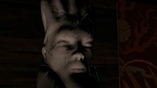
This image shows the high poly statue all nicely lit and textured. I was very happy with the shot as I put alot of effort into modeling the statue. I modeled and textured all the things in the shot expect for stephs candles that really were well textured. The lighting was creating by Sanjay. In comp I played with the levels to create a nicely background with the red tint keeping the smooth grade we want between shot.
Above show two images of the hardest shot I think we had to make The oceon and boat together was a real trouble. Sanjay first set up of the ocean was done by Sanjay. But after rendering the oceon was way to fast for the calm ocean we wanted. So I slowed down the ocean making using reference to work from. Steph created the lovely stormy clouds for the shot and created the IBR. I then added more lights that were only linked to the ship as it was very dull when we only had the IBR. Also I added in one last light that only effected the ocean to give us that sunshine reflection I wanted to bring into the shot then slow disappears as things try to show bad times ahead.
The transition shot shows alot of well made models from me, steph and greg. These shows had work done in comp as we wanted to change the lights in the transition show we had a nice contrast as the camera pans down into the lower decks of the ship.
The first shot that shows the cracking of the statue showed the statue with the low poly version. Due to the power needed to created the effect the laptop Sanjay was working on wasn't enough to work with my first model I made. So I created a lower poly model which was broken up into three bits as Sanjay needed it broken down. Unfortunately this played problems with the displacement maps as the render wasn't as I planned but due to time we made the shot darker trying to set the mood.
Above show the two shots that join together to create the turning of the tide for the ship. The ink spill was meant to represent a wave then a shot of a storm would follow showing ship in troubled times. I worked on both but Sanjay really got the ink shot down after his effects were created. I took the real ship and went about playing with that. Firstly after some renders we decided to get rid of the 3D rain as it didn't fit with the other shots that had rain and looked very bad so I did the rain in comp. I also added the fog to create that look that this was a sailors worst nightmare. The stormy clouds were done in Maya. We worked out away of creating a the illuminate lanterns but upper the ambient colour and incandescence which gave a lovely glow through the fog.
Alll the flag shots were animated, lit and compositied by me. The first flag shot you see was a very strange shot as the render came out terrible and there wasn't enough time to re-render. But the final two came out nicely. I added in 2D rain and played with the render passes I set up to blend it in better with the sky which I blurred. Then gave played with the levels as well as grading it with a blue darker tone to show the storm and dark times.
The final shot. A simple shot but one of my favourite shots when we were getting the animatic together. Sanjay Setup the scene but the I composited the smoke effect at the end as we felt it was missing something when the flame went out.


No comments:
Post a Comment