During this project I took the role of producer. I took this as a big thing as I wanted to set a level of working that others would meet and mostly everyone did this and really put the work in. The amount and level of work was amazing. We really had a very hard project to complete as we set so many goals and challenges to reach.
I through out wanted to keep the pace and try and keep things organised as sometimes things get forgot about or not to the level of other things. Yes I think we could of done shots alot better, but could we do all the shots better in the amount of time we had? No. So thats why we set a standard of work that we could do throughout and get a nice final piece that shows depth and the amount of things we had to learn to get our result. The over outcome was not one persons hard work but a team of hard working individuals. This shows with some of the great outcomes.
I was editor and compositor during this project but Steph, Sanjay and Greg were always with me offering their input and guidance of how to improve. The end credits were all done to Sanjay and Greg as they took an idea and made a great little ending to an amazing project. I was happy with some of my models that came out of this but my idea of this project was learning and trying new things. So getting back into maya from Zbrush and using topogun to help in this was something I wanted to try out. With more time and Development my models and textures would of got better and better. My uving and texturing as improved so much, I am more than confident enough to take a model and put a good level of textures to it.
This project has taught me many things and one is never ever underestimate how long it takes to render. We took over three and a half weeks to render, Thats literally none stop and through the christmas holidays. But we finished everything a week before the deadline. But next project I will make sure rendering is constantly going on and we work to finish shots in a good amount of time.
But I have enjoyed this project and the outcome shows this. We didn't want to produced a simple flyby, we wanted to create a story with depth and meaning. This showed when we completely redesigned our idea and really thought about the shots and tried to have the models in the shot mean something. We thought about what each model, light and composition of the shot and the meaning of which we laid them out so the viewer didn't get confused about what was going on. So we didn't have loads and loads of things going on as the shots would get cramped and confused.
I am very pleased with the outcome and work that has gone into it. We are all proud to be a team and looking forward to working again together next term!
Tuesday 11 January 2011
More examples of Lighting and Compositing!


Shot compositing and Colour Grading.
These next selection of blog posts show the work I did on shots and the colour grading I did to improve on our renders


Above shows two images, bottom one is before second one is after. What we wanted was a red gradiant over everything to give that sense of warmth and the outside a blue showing contrast between the two. the top image shows the final grade. For this show it was my concept of the candle shots but the lovely modeling by steph and the candles by sanjay made the scene. I added a blurr and colour grad in comp.


Here is another example of grading (top is before, bottom After). Only a slight change in these images but when grading the difference was so much and it created great depth and continuity with the other shots. For this shot I modeled and texture the whole room with the door that was modeled by steph. As well as texturing and modeling the sword and modeling the sword stand with steph texturing it. For this shot I was set up the camera. I worked with lights set out by greg and refined them once all the models were implemented. I timed the animation as well as sorted the placement for the map but greg was the animator of it with steph texturing it.


The three images show other stills from the long shot of the admirals table shot. These were the final images after grading. the last image was a difficult shot to grad as when I started it was very bright door with saturated colours and to much light. But in comp I was able to change the levels and get the contrast of the shot better then add our red tint preset we created.
Monday 10 January 2011
Development lighting and Quality control Living Quarte
These images show how we developed the shot and went through quality control on each part of our render. First two images show the change in lighting and some attempts with out using global illumination


All the images above show the work we went through we was checking each texture and seeing its specular, Reflections and diffuse. These images show the development of the bamboo and how we changed it to get a better result. Final image shows the settings we left it with.


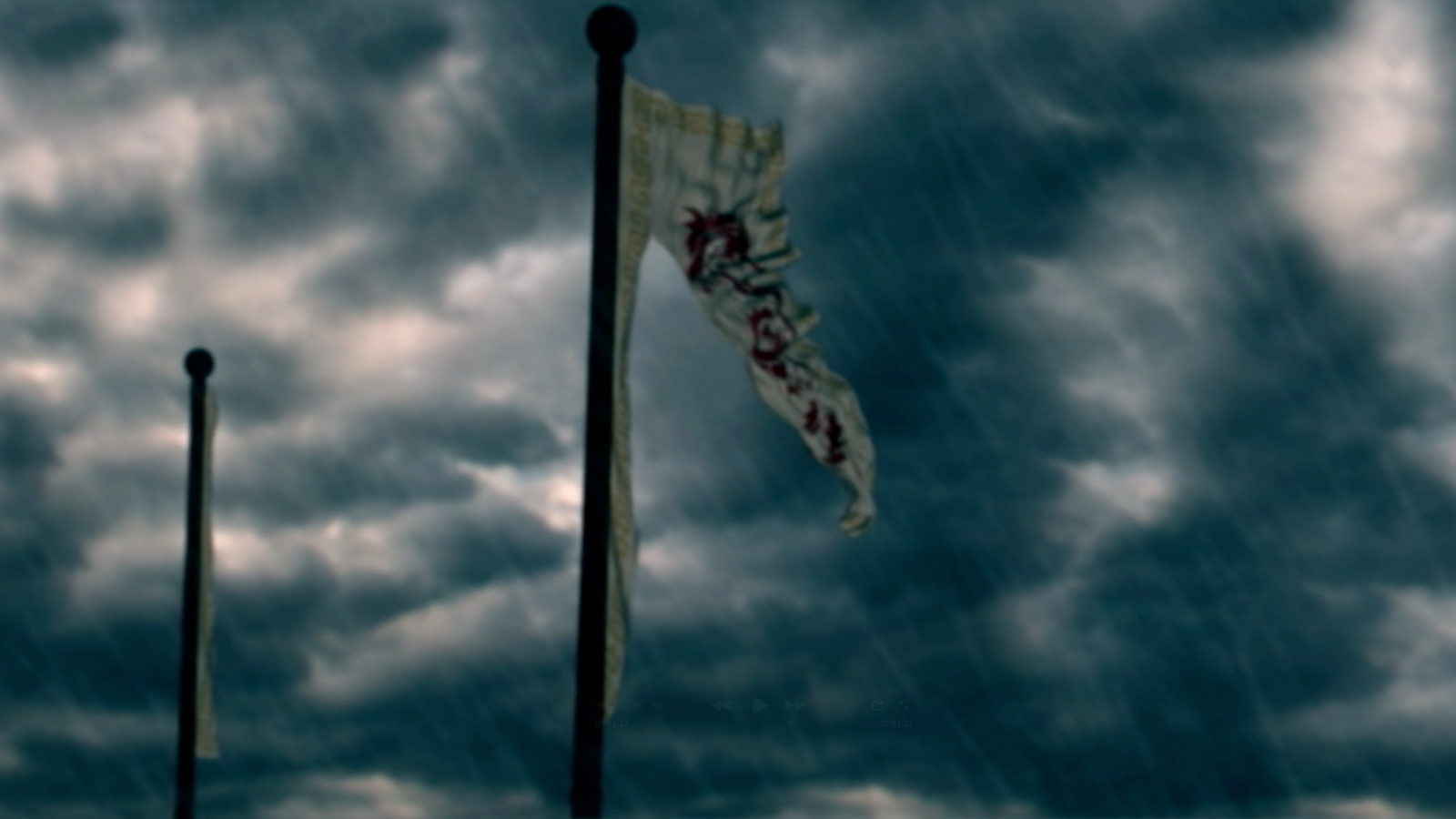
Flag Animation
Here is a collection of videos showing my work on getting the flag to rip. I had to create a concept and technique of how to do it, I will try explain how I got there in the end.
Firstly modeled the flag, simple plane, I modeled in the rips so where I wanted the tear to happen and what shape.
Then I combined them back together the vertex's as I still wanted it to rip. So when I applied the nCloth everything just fell apart but thats ok! I then did a contraint to the pole so that got the flag to hold on. But the section that isn't part of the section attached to the pole still is falling. So again another point contraint with the vertex's. In the option tab I was able to apply glue. Meaning a certain amount of disturbance would make the points rip. This was trial and error, These is only a section of the 50 attempts to get the desired effect. I had to play with the effects and settings of the wind. Many the direction was important as we wanted it to rip off screen.
Unfortunately one of the worse shots that came out of the render process was the calm flag at the beginning which was nearly impossible to light and setup due to technical problems with the cloth and its render. Due to time also we had to choose either to re-render or work on more important shots to the development of the story.
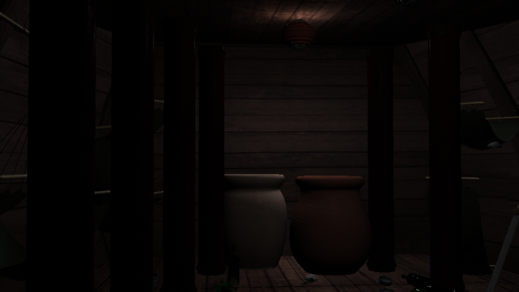
Storage Room Development

Here is the shot of the storage room. Showing the empty room with the old disgusting water and the split rice sack pouring out.
The models of the grain sack and Barrels were textured and modeling by me. I textured the walls and floor also. Me and Sanjay worked on this shot alot together. There are 3 shots intotal that show this room starting from a zoomed out shot and then each shot slowly moves closer. I did the lighting for this one then worked with Sanjay to get the rest of the room looking the way we wanted.
I also composited the red tint to the shot as we want there to be a contrast between the outside and inside of the ship.


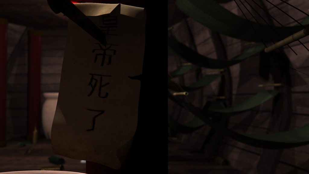
In this shot the outer walls were textured by me. I modeled and textured the not and the dagger stabbing into the pillar. The camera for this first long shot of this room was firstly animated by me then developed by greg as he did the setup of this room.
Subscribe to:
Posts (Atom)